A little over a month ago, I discussed the inverted yield curve and applied it to the NBA, and then I later presented the inverted yield curve for MLB pitchers. In this piece — with the launch of our new PGA product (free while it’s in beta) — I am going to apply this economics concept to golfers. In the words of Gilderoy Lockhart, “I must ask you not to scream.” Ultimately, I’m going to show you a trend that could help you avoid mid-priced drivers who, as a cohort, have historically sucked.
This is the 23rd installment of The Labyrinthian, a series dedicated to exploring random fields of knowledge in order to give you unordinary theoretical, philosophical, strategic, and/or often rambling guidance on daily fantasy sports. Consult the introductory piece to the series for further explanation on what you are reading.
Reminding You (Again) How Boring Economics Can Be
In case you don’t remember: An inverted yield curve (to quote my first article on the topic) “is the graphic representation of an economic environment in which the current market provides higher interest rates for short-term debt instruments than for long-term debt.” This is what it looks like:
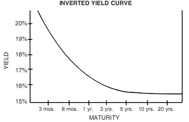
In general, it’s almost never good when a graph descends, and the same is true here. As I wrote in my second article on the topic . . .
Essentially, an inverted yield curve is the sign of economic instability. In a regular financial environment, a positive correlation exists between loan duration and interest rates. The longer the loan, the higher the interest rate. There are times, though, when a negative correlation exists between time and interest rates — when short-term Treasury bonds have higher interest rates than long-term Treasury bonds. And when that happens the United States normally experiences an economic recession.
An inverted yield curve can’t really tell you which circle of economic hell you’re likely to be in shortly (the stock market almost always crashes within a year of an inverted yield curve) — but, rest assured, when an inverted yield curve occurs in the debt market, the economy will be in some version of hell fairly soon.
The Virtues of Thinking Negative
And while I’m on the topic of negative thinking: more of us need to think negative more often. In science, a common (though underappreciated) best practice is the process of strong inference, in which researchers test multiple hypotheses at once and seek to prove as false as many of those hypotheses as possible. As backwards as this might sound, the bulk of our knowledge and the majority of our scientific advances are rooted in experiments that disproved something, all because the researchers bothered to ask the question, “What is this not?”
I’ve written about the power of negative thinking before, but this point is so important that it bears repeating: Figuring out who not to play in DFS is just as important as figuring out who to play. Avoiding landmines and bullets is how one survives in a battle. The goal is not to bleed.
In DFS, identifying players likely to perform poorly helps you avoid lineups that fail to cash. That point seems obvious — and it is — but people fail to identify potentially negative players way too often.
The PGA DFS Inverted Yield Curve
The PGA DFS inverted yield curve is all about helping you identify those golfers who have elevated chances of destroying lineups.
It’s pretty easy to apply the dynamics of the inverted yield curve to PGA. We want to focus on factors showing a divergence between the normal correlation that should exist between time and money on the one hand and yield (or production) on the other hand.
In our PGA Trends database, the interplay between time, money, and yield can be seen through a simple backtest. Let’s look at golfers whose seasonal salaries have increased but whose seasonal salary-adjusted production has been negative (per our Plus/Minus metric):

This is such a straightforward trend, and its virtue is that it shows us something that we can’t see by looking at the Pro Trends (which show positive Plus/Minus production) and the Models. By simply looking at the divergence of long-term salary and recent production, we are able to identify a large group of players who consistently and dramatically underperform the salary-adjusted expectations with negative Plus/Minus production.
In building a lineup, if all you did was avoid any golfer who matched for this trend, you would already have a huge edge. And it’s possible to make this trend even more negative if you are fine with reducing the sample size.
For instance, to ensure that the Plus/Minus isn’t artificially inflated because of elite golfers — and because in constructing lineups we often treat high-priced golfers differently than everyone else — we could create a salary range of $5,500 to $9,500. For this weekend’s Arnold Palmer Invitational, $5,500 is the minimum salary and the $9,500 maximum excludes the eight highest-priced golfers:
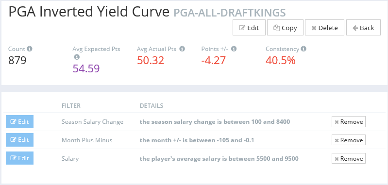
Yep. When we factor out the elite golfers (high-priced guys who can transcend salary in any given slate), we are still left with a large sample of golfers who collectively underperform their salaries by -4.27 fantasy points.
And we can do an even better job of screening out elite golfers.
What would happen if we removed from the sample all those golfers who, based on the golf futures market, have less than a 20 percent implied chance of winning the tournament in which they compete?
That seems reasonable, in that for the Arnold Palmer Invitational the golfer with the best chance of winning (Rory McIlory) still has less than a 15 percent implied chance of doing so. Filtering out the golfers with outrageously high implied odds not only is another way of filtering out potentially elite golfers, but in this case it also makes the sample more similar to the golfers in this slate:
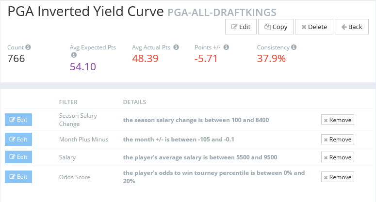
BOOM! With a -5.71 Plus/Minus, these golfers are landmines waiting for you to jump on them.
Finally, if we want, we could add another production filter to the trend by screening for players with a Pro Trends Rating in the bottom 80 percent of all players, once again to ensure that we aren’t screening for elite golfers:

And if you wanted to keep on going you could. I’m fine with stopping here. It’s enough to have a strong negative Plus/Minus trend that (as far as the average trend goes) applies to a relatively large sample of the total PGA population.
Without question, this trend is the functional PGA DFS equivalent of an inverted yield curve: As a cohort, the players who fit this trend fail consistently and dramatically.
Black Swans and Rule No. 1
In DFS, negative Black Swans are the rarest of birds. They are those who are widely expected to do well — or at least to live up to their salaries — and then they suck and thereby destroy a high percentage of lineups in guaranteed prize pools.
On occasion, inverted yield curves can help us identify potential Black Swans. For instance, in today’s PGA edition of the Daily Fantasy Flex Podcast, both FantasyLabs PGA Director Colin Davy and Founder Peter Jennings named Will Wilcox as their top “bargain barrel” (under $7,000) DFS play of the slate. Colin even said that picking Wilcox was “almost like a weird affirmation of the conventional wisdom.” Pete even jokingly said, “That’s the only pick I have. . . . He’s going to be so heavily owned, too.”
The issue is that Wilcox is a current match for the PGA DFS inverted yield curve. He’s a potentially dangerous plays, and all the more so because he is expected to do well and to be in a high percentage of lineups. That’s not to say that Colin and Pete and conventional wisdom are going to be wrong regarding Wilcox at the Arnold Palmer Invitational. But this is to say that, if you are hunting for a negative Black Swan in this slate, Wilcox has the enhanced potential to be one.
But even if a Black Swan doesn’t emerge from the current matches for the inverted yield curve, this trend does consistently generate mid- to low-priced guys who could easily be in your lineups, especially if you use our multi-lineup generator to create those lineups. In GPPs, in which the margins between winning, cashing, and losing everything are fairly slight, having even one suboptimal golfer in your lineup is devastating, especially when only six golfers fit in a lineup. Simply by eliminating these players from consideration and then creating your GPP lineups, you could radically increase your chances of cashing.
As I’ve said before, the first rule of value investing (whether one invests in the stock market or cars) is the following edict: Don’t lose money.
By avoiding the golfers who match for the PGA DFS inverted yield curve — golfers who have historically failed to live up to their salary-adjusted expectations — you will have a much better chance of not losing money . . . and of winning a lot more money.
———
The Labyrinthian: 2016, 23
Previous installments of The Labyrinthian can be accessed via my author page. If you have suggestions on material I should know about or even write about in a future Labyrinthian, please contact me via email, [email protected], or Twitter @MattFtheOracle.