As DFS baseball players, we realize that some parks are easier to hit home runs in than others. Most of us even realize some parks are easier for batters to hit them in depending whether they bat lefty or righty. I’m more of a visual person though, so I like to actually see where a well-hit ball is likely to land given the data we have available.
Through the use of a couple of external tools and the trends here at Fantasy Labs, we can see on-screen whether a player is more or less likely to hit a home run at a specific stadium when they are playing away. The first and most important thing we need to find out is where a player is actually hitting the ball. Luckily, Fangraphs has a team of dwarves hiding in the upper-balcony at every MLB stadium just mapping out where batted balls land with a compass and some graphing paper (or however they do it).
Another great tool is ESPN’s Home Run Tracker (ESPN Home Run Tracker). There is a ridiculous amount of information about every home run hit in recent seasons, but the thing I like to use is the Park Overlays tool. This shows you all the hits that resulted in home runs at one stadium and then imposes the boundaries of a second stadium right on top of that so you can see what would and wouldn’t be a home run in different ballparks.
The third tool that really puts things into perspective is the Fantasy Labs Plus/Minus tool. I find myself coming back to Plus/Minus in almost every article, but it’s because I find the idea of seeing how a player actually performs based on how we would have expected him to perform really powerful. Now, let’s go through a test case. Here’s Mike Napoli:

We see some power to right, some to center, and most to left. So what if the Red Sox are in Tampa for a series with the Rays? Here is Tropicana Field imposed over Fenway:

Okay, so Napoli’s power to center shouldn’t be affected at The Trop and he adds a few home runs to right based on his spray chart and right field’s dimensions in Tampa. Most of his power is to left, though, and while he doesn’t have to contend with the Green Monster, left field at Tropicana is still a pretty significant 35 feet deeper than at Fenway. So how has Napoli actually fared in road games against the Rays?

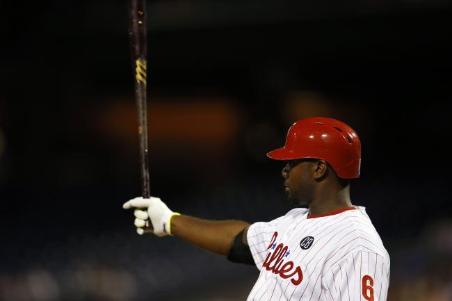
Home Run Tracker has another feature called “Just Enough” which tracks home runs that just made it over the wall. Tied for first in that category this year is Ryan Howard with seven. Here is his spray chart for 2015:

Do some of those “Just Enough” home runs make it out at, say, Nationals Park?

Or do the farther fences in right and left fields sap some of Howard’s power, causing him to perform below his projections?

So this is a really fun thing to play around with and when you start factoring in the opposing pitcher as well, you start to get a much clearer picture of who has the best chance to hit a home run.